Organize - A User Interface Story
- Ryan Redenbaugh

- Jul 28, 2021
- 2 min read
Updated: Jun 3, 2024
This may seem like an easy thing to do at first glance, but with constant development between Edwards Lifesciences and secondary monitor company’s, daily life for a OR/ICU clinician can get complicated. User Interface Design comes in many forms...

I was given the task to sort out Edwards HemoSphere signals and how each is exported out of the device to provide a secondary set of eyes, sort of speak, to view specific signals on.
NEED STATEMENT: Clinicians worldwide oftern are given unfamiliar devices and have limited to NO knowledge on how to correctly hook up and send signals to other monitors.


Quick connection detail inspiration. Example of what I was given .
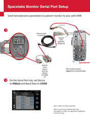
Throughout years of separate development between Edwards Lifesciences and other monitor manufactures, cabling/settings/ports/GUI updates/NEW modules, were are specifically created to work together as one cohesive unit. The main issue is that none of this was centrally documented in an ALL IN ONE graphic/booklet that easily shows (not tells) the end user how and what to use to achieve the desired signal on a specific monitor.
FINAL LAYOUT


Graphics / User Interface with limited text is the universal language. If a Quick Install Guide can show the user graphically how to do something – the end result will be achieved quicker than with descriptive text only. A picture is worth a thousand words. OR can be 2000 if translations are involved.
The design language that I chose to use was a simplified lineart illustration look where small device features can easily be eliminated and the key details of the connection can be highlighted and magnified.
Layout Theme: Main components on the left with part #'s and simple icons.
Center has the all-in-one connection graphic with NO text for translation.
GUI setting on the bottom row.
Ryan


Comentários